Making the Invisible Visible: Feynman Diagrams and Visual Storytelling
When Richard Feynman introduced his diagrams to explain interactions between subatomic particles, he wasn’t just simplifying an equation. He was creating a new visual language. A way to see what could otherwise only be calculated.
For anyone who creates presentations, Feynman’s move is a powerful lesson: we don’t always need to explain more; we need to show better. And often, what truly makes a difference isn’t the amount of information, but the quality of the relationships we make visible.
In this article, we’ll explore why Feynman diagrams are a useful metaphor for presentation design and how we can learn to better visualise what really matters: the connections between ideas.
Feynman: the physicist who thought in pictures
Richard Feynman was one of the most brilliant theoretical physicists of the 20th century, known not only for his work on quantum mechanics and quantum electrodynamics but also for his unique teaching style. He disliked complicated jargon. He preferred drawings, metaphors, and stories.
““What I cannot create, I do not understand””
He wrote. And with his diagrams, Feynman created understanding.
Feynman diagrams were invented to visually represent interactions between particles: collisions, energy exchanges and transformations. A visual language that helped physicists navigate the chaos of the subatomic world. They weren’t mere diagrams but narrative maps of invisible relationships.
These diagrams became symbols of conceptual elegance: simple, yet rich in meaning. And that’s exactly where we can draw inspiration for our work with presentations.
In a way, Feynman, deep down, was one of us.
Visualising relationships, not just content
When we create a presentation, we often focus on the information we want to share: data, concepts, and results. But the real power of a presentation lies in the relationships between these elements: how one idea connects to another, how an image prepares the ground for a concept, and how a glance at the audience sets up a transition.
Like Feynman diagrams, a good presentation doesn’t just represent individual pieces: it captures the interaction between them.
Yet too often, we see slides filled with bullet points. Or graphs without any narrative context. Or images added just for decoration. The result? The noise the audience struggles to interpret.
The real challenge is building slides that show interconnections, turning every element into a meaningful node within a network.
Thinking like Feynman: meaning lives in the relationship
Feynman diagrams don’t say, “this particle is here” or “that particle is there.” They say: “This particle interacts with that particle in this way.” It’s all about interaction.
That’s the core lesson for presentation designers: a strong slide isn’t a static frame; it’s a visual relationship. Every number, every word, every graph exists in function of what surrounds it.
For example:
A revenue increase only matters if linked to a strategy or timeframe.
A customer image works if it represents a viewpoint, need, or emotion.
A quote resonates if it opens or closes a narrative loop.
To think like Feynman is to see your slides as dynamic meaning maps, not static containers.
From the microcosm of particles to the macrocosm of presentations
Imagine your next presentation as a giant Feynman diagram. Each slide is a node. Each transition is an arrow. Every pause, gesture, or tone change is a particle moving through the space between ideas.
This mindset helps you ask:
What movement am I creating for the audience?
Where does my narrative energy come from?
How do my ideas evolve?
This dynamic vision helps you avoid the “slide-by-slide” trap. It pushes you to think in terms of flow, interaction, and transformation.
Just like in Feynman diagrams, what matters is not just where things start, but what happens while they interact.
Tools and approaches for more relational visual storytelling
1. Non-linear visualisations. Sometimes, a concept map or circular layout represents relationships better than a linear sequence. Radial infographics, network diagrams, or flow-based models tell stories of connection, not just hierarchy.
2. Simplify to reveal. As Feynman said, if you can’t explain it simply, you haven’t understood it well enough. The same goes for visuals: better to show fewer well-connected elements than many disjointed ones.
3. Animations that narrate transitions. Used intentionally, they visualise change — a concept transforming, a new idea emerging, a connection forming. They don’t decorate; they tell.
4. Colour and position as relational codes. Use similar colours for similar ideas. Use spatial proximity to show connection, and separation to mark contrast. Design becomes a grammar of meaning.
Exercise: sketch your next presentation like a Feynman diagram
Before opening PowerPoint, open a blank page.
Plot your key message nodes: the core ideas you want to communicate.
Draw arrows: ask: how do these ideas interact? What triggers what? Where is the exchange of energy, focus, or insight?
Spot blind spots: is something left unspoken that needs to be made visible?
Simplify: remove everything that doesn’t support a key relationship.
Don’t draw slides. Draw connections. Like Feynman, begin with relationships, not with content.
Beyond his diagrams, Richard Feynman is also remembered for his learning method: explain every concept in simple terms, as if speaking to a child. This is known as the Feynman Technique — a powerful exercise in clarity, intellectual honesty, and simplicity.
At its core, it’s also storytelling: removing, clarifying, connecting. Whether through words or images, the goal is the same.
If you can’t explain it simply, you probably don’t understand it yet. And if you can’t show the relationships, your audience might never see them either.
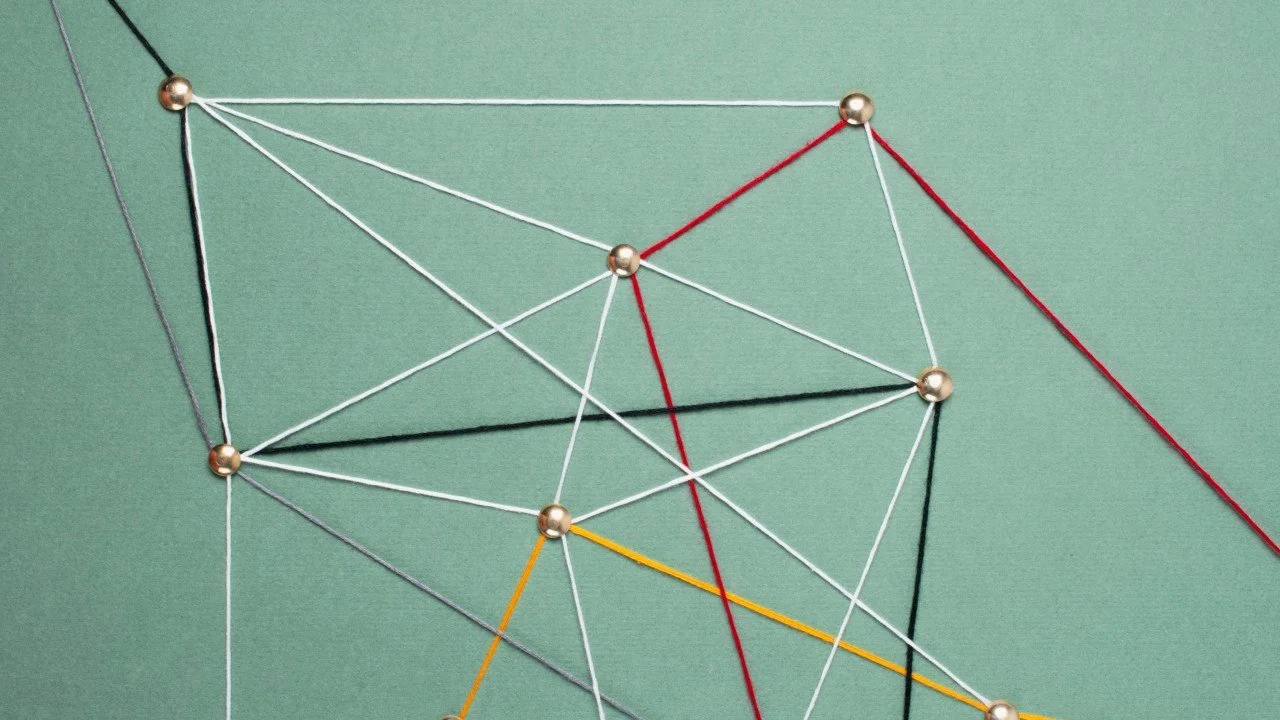
Diagrams often help manage multiple possibilities in a story.
atelierdoodle.com/a-better-story-is-waiting/quantum-storytelling-multiple-ideas
This article is part of Quantum Presentations: a series exploring how ideas from quantum physics can elevate storytelling, communication, and presentation design.
Curious to bring more clarity, emotion
and intention into your communication?
Discover how I support brands and leaders in crafting stories that move people.